But I had a nasty surprise when I updated my Watch. Instead of that very minimalist look, the watchOS 9 complications are far from minimalist.
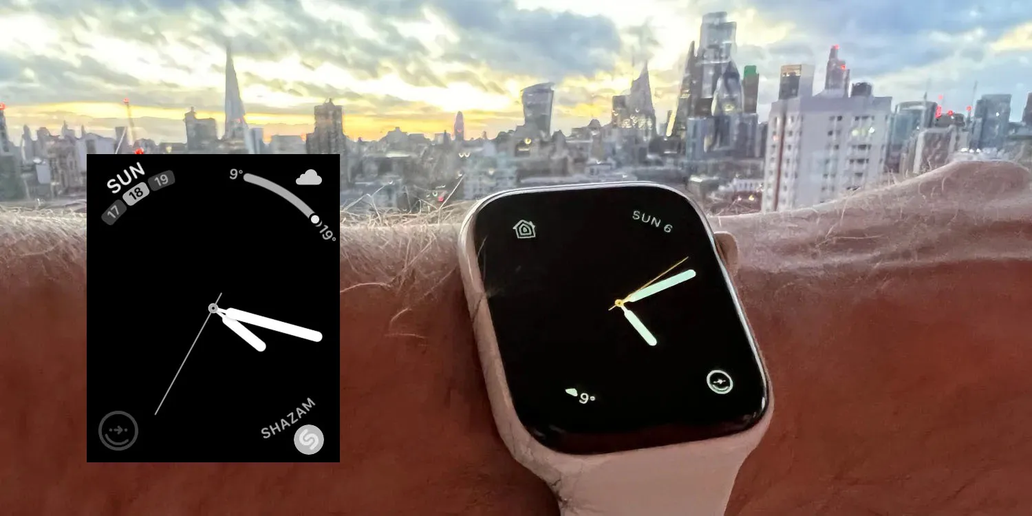
I’m sure they look great in some watch faces, but definitely not in the most pared-down Simple face. Instead of a simple day and date, there’s now three tiles with today’s date in the middle. Why?
What was a simple weather icon and a temperature now has a bigger icon and a curved bar with the temperature range for the day.
Shazam now has the icon plus text – like I’m going to forget the meaning of one of the four complications I’ve chosen to display permanently.
CityMapper has been left alone, but only, it appears, as a result of a bug. The icon is grayed-out (though it does still open the app when tapped).
Please, Apple, give back my minimalist complications. At the very least, give me the option to choose between simple and complex versions.