This new design for the Watch Now feature of the TV app was first previewed back in November during tvOS 16.2 beta testing, and it was heavily criticized at the time. Interestingly, Apple listened to that feedback and made one notable tweak.
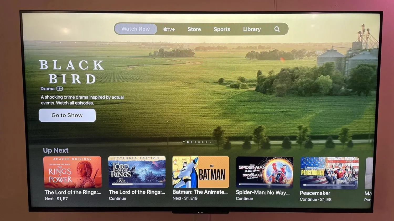
The first version of the new Watch Now design in the TV app added a new “Featured” row to the top of the design. This meant that the more useful “Up Next” row was pushed lower, requiring you to scroll down to view your queue.
In the version of the TV app that is now rolling out to Apple TV users, that “Featured” row is no longer present. Instead, the “Up Next” queue retains its top-level positioning for easy access. Unfortunately, Apple’s trade-off for this is an aggressive, monstrous banner at the top that cycles through so-called “Featured” content.
This “Featured” content appears to be editorially chosen. This means you’ll see content from apps that integrate with the TV app, like HBO Max and Hulu… and, of course, Apple TV+. Making matters worse, you’ll even see massive banners for content you’ve already watched. There’s no system in place to hide previews for things you’ve already seen.
This banner not only plays video previews of the featured TV shows and movies but also audio. If you allow your tvOS cursor to rest in this banner area for just one second, the preview video and audio will automatically kick in.